FRUIT OF THE LOOM
Reskinning fruit.com to bring brand storytelling and personality to the forefront

Project Brief
Fruit of the Loom partnered with GSD&M to reskin fruit.com as part of a broader brand refresh. The goal was to update the site to enhance the visitor experience by providing a consistent look, feel, tone, and messaging across all consumer touchpoints.
The updated digital experience also needed to support long-term content scalability, with modular templates that facilitated monthly updates across lifestyle and branded content. By improving consistency and clarity, the reskin would create more opportunities for brand storytelling and help foster a deeper emotional connection with consumers.
Success Metrics
-
Simplify the experience by reducing visual clutter and eliminating decision fatigue
-
Establish a consistent, modular system that encourages exploration and reuse
-
Facilitate brand storytelling and emotional connection
-
Prioritize accessibility by applying WCAG guidelines to all templates and components
-
Deliver scalable templates to support long-term monthly content updates
The Process
01
Discovery
The comprehensive discovery phase included an existing content audit, as well as a competitive landscape review. Key insights from this phase directly informed our approach and system recommendations.
02
UX Design

Homepage, Category Landing Page, and Product Listing Page (w filters) wires

Main menu/navigation wires
03
System Design and Application
This phase focused on defining the visual language and system elements that could be reused across all templates.
3.1 User Interface
The first step was to develop the building blocks of the design system. This included typography, color, spacing, button styles, image and text styles, and voice/tone guidelines for web copy.


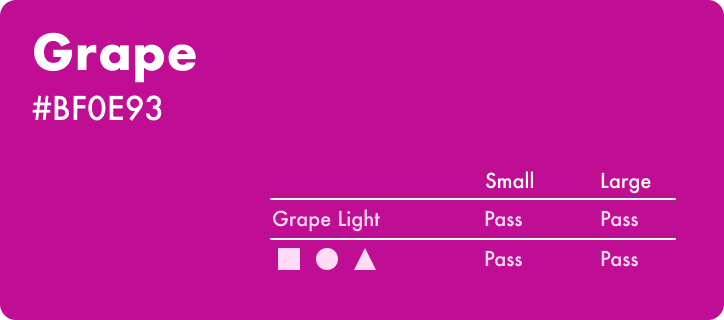

Color palette with WCAG color contrast ratio requirements for large and small text and objects.

Text styles for headline, subhead, paragraph, button, and eyebrow text.

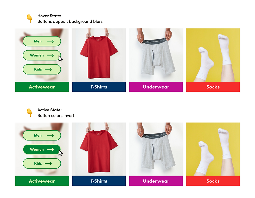
Button variations and hover/active states.
Button usage examples with images backgrounds and solid backgrounds.
3.2 Module and Template Development
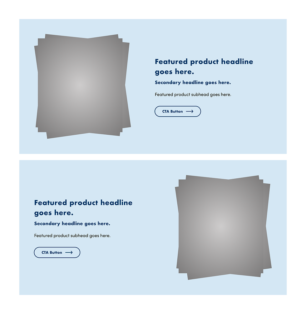
Using the new UI system, I designed modules and variants to be applied to page templates.

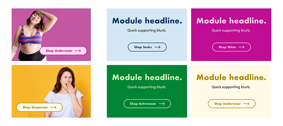
Product display module variants with auto layout applied to Homepage template.
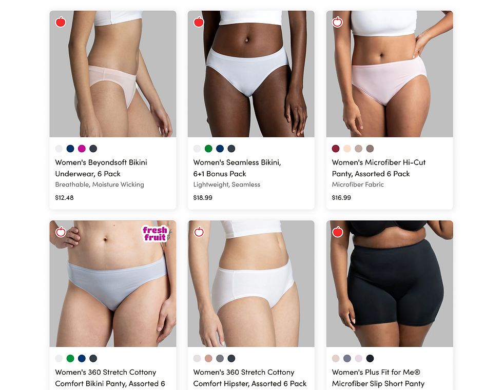
4-up product display and product card modules.

Templated Homepage, Women's Category Landing Page, and Collections Category Landing page
Results & Reflection
We delivered a comprehensive Figma file for internal client developers, ensuring every element was annotated and backed by visual and accessibility standards. Though implementation was handled client-side, we provided light interactive prototypes where needed.
By designing for reuse and clarity, we helped build a system that supported both creative storytelling and operational scalability, while honoring a brand that’s been around for over 170 years.
Challenges
-
Designed within the constraints of fruit.com’s existing CMS, limiting structural changes
-
Worked in parallel with a new brand campaign, requiring flexibility and collaboration
-
Adapted designs late in the process to incorporate new campaign photography and materials
-
Handoff to an external development team posed challenges due to limited oversight and continuity support
Original Design

Wireframe

Final Design
